
Overview
HeyMath! was developed in collaboration with the University of Cambridge with a mission to make every student and teacher as effective as the world's best in mathematics. The platform served multiple segments simultaneously: individual students, classroom teachers, school administrators, and enterprise institutions — each with different goals, workflows, and expectations.
After years of organic growth, the web platform had accumulated fragmented experiences across these segments. Consumer marketing, institutional login, student learning, and teacher management all lived in an inconsistent visual and interaction language. I led the comprehensive redesign that unified these segments into a single, coherent platform identity — while preserving the distinct workflows each segment required.
The Problem
HeyMath's web presence had grown in layers rather than as a designed whole. The marketing site, student portal, teacher dashboard, and enterprise landing pages were visually inconsistent — different type scales, colour usage, and interaction patterns — and navigationally disconnected.
This fragmentation created a trust problem: enterprise clients and institutional partners expected a platform-grade product. What they encountered looked like a collection of microsites.
The product was excellent. The platform didn't look like it.
Specific problems
No unified visual language: The student portal used a completely different colour palette and type system from the marketing site. A new teacher clicking through from the landing page arrived at a product that felt like a different company.
Enterprise credibility gap: Institutional partners — school districts, educational ministries, and Cambridge-affiliated bodies — needed a platform that signalled academic credibility and technical maturity. The design undermined the relationships the sales team was building.
Student engagement drop-off: The student learning flow had multiple points of friction between the content (excellent) and the interface (dated). Engagement data showed consistent drop-off at the same transitions — each a navigational or clarity failure.
Research
I conducted research across all four user segments — which meant operating as researcher, designer, and client liaison simultaneously.
Student journey mapping
Shadowed students using the platform for homework sessions. The mapping revealed 6 friction points between login and first content interaction — each one reducing the chance a student would return the next day. Reducing this "time to first value" became a core design goal.
Enterprise client interviews
Through direct client relationships, I gathered feedback from institutional buyers — school principals, curriculum coordinators, and district-level administrators. Their primary feedback: the platform felt "underpowered for its reputation." The content quality was world-class. The packaging was not.
Competitive benchmarking
Audited Khan Academy, Mathletics, IXL, and DreamBox — mapping where each sat on the consumer-to-enterprise spectrum. HeyMath's distinctive position (Cambridge-backed, curriculum-aligned, teacher-centric) was genuinely differentiated but not expressed in the design.
Design Strategy
The strategy had three pillars: establish a unified visual identity, reduce friction in the student learning journey, and elevate the enterprise credibility signal throughout.
Single design language
Established a foundational design system: a 12-column grid, a single type scale (4 weights, consistent sizing), a refined colour system with primary blue, secondary amber, and semantic states. Applied consistently from marketing homepage to student exercise screens.
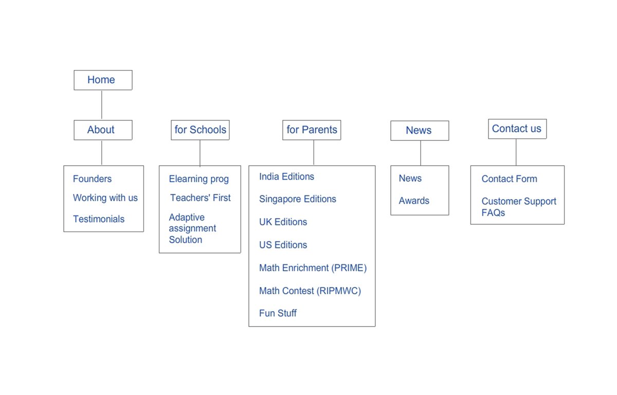
Segment-aware navigation
Rather than a single navigation serving all users, designed a context-aware navigation model — the same header adapted its CTAs based on authentication state and user role. A student saw "My Lessons." A teacher saw "My Class." An unauthenticated visitor saw "Get Started."
Cambridge partnership as a design asset
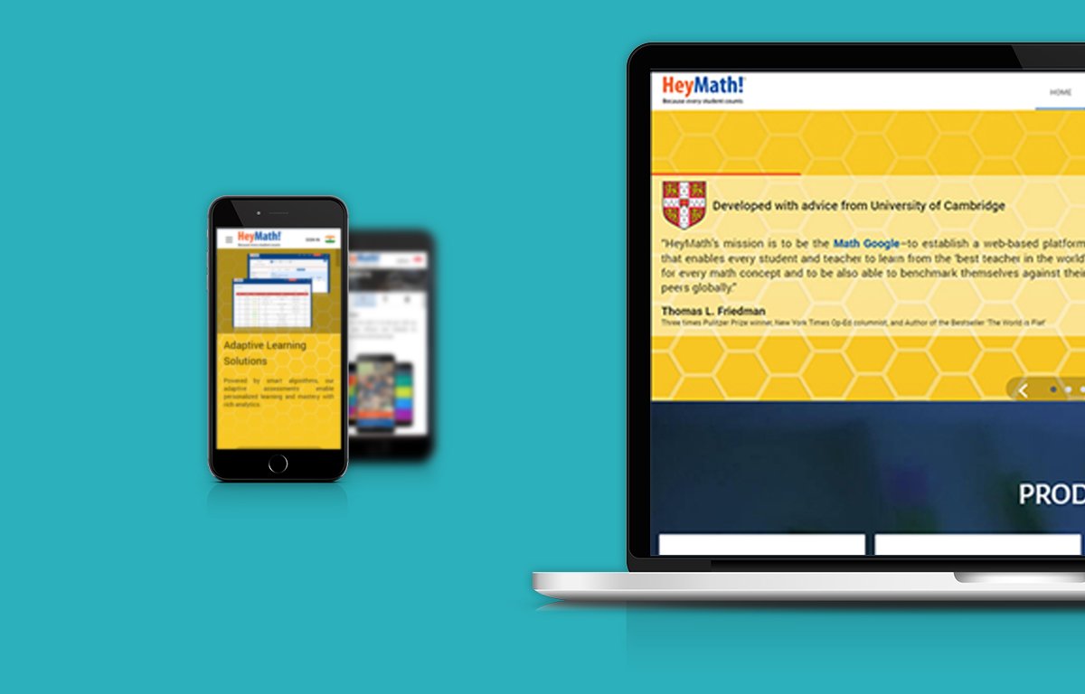
The University of Cambridge endorsement was underused. Redesigned the trust hierarchy of the homepage to foreground this partnership — with a testimonial from Thomas L. Friedman (NYT columnist) as a secondary credibility signal. Enterprise visitors needed to see this immediately.
Design Execution
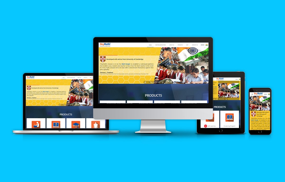
Homepage redesign
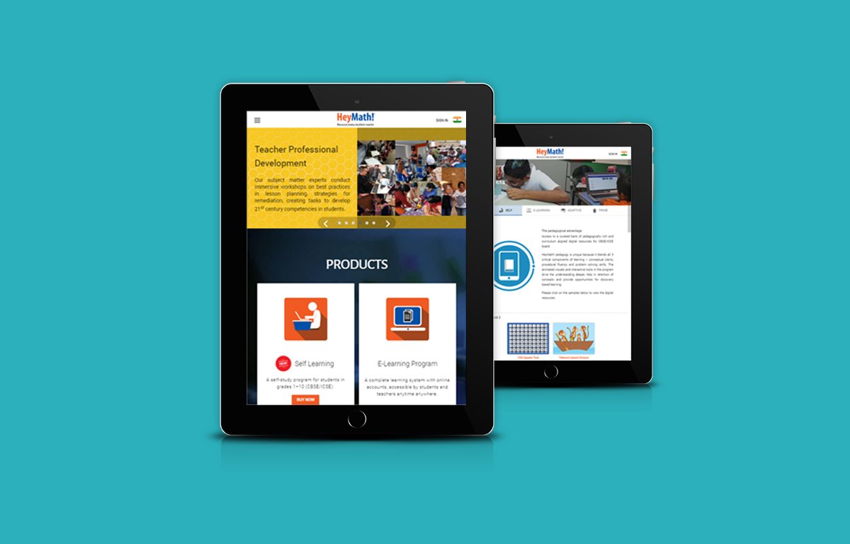
The homepage needed to serve three audiences at once: prospective enterprise clients evaluating the platform, teachers curious about the content, and individual students or parents. The hierarchy placed the Cambridge credibility and vision statement above the fold, with a clear product segmentation path below: "For Students," "For Teachers," "For Schools."
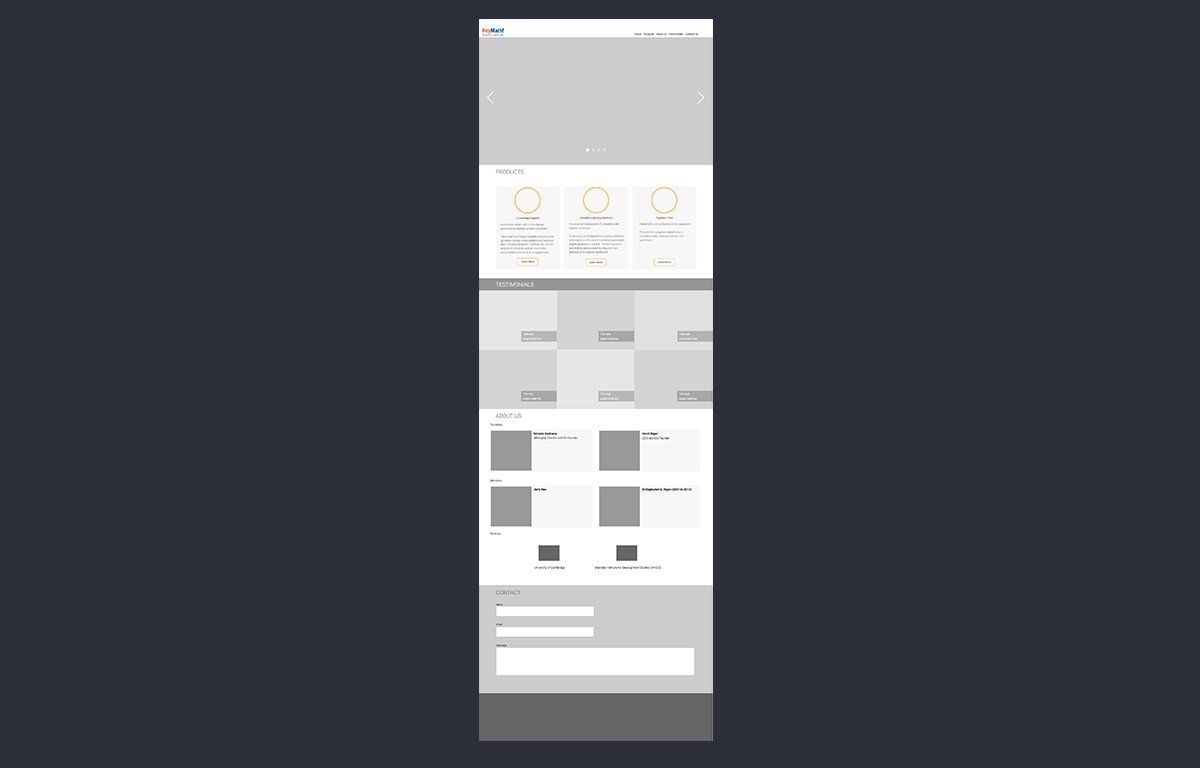
Products section
Redesigned the product overview to clearly communicate the platform's scope: video lessons, interactive exercises, teacher assignment tools, and performance reports. Each product card linked directly to a live demo or trial — reducing the time to first experience for evaluating institutions.
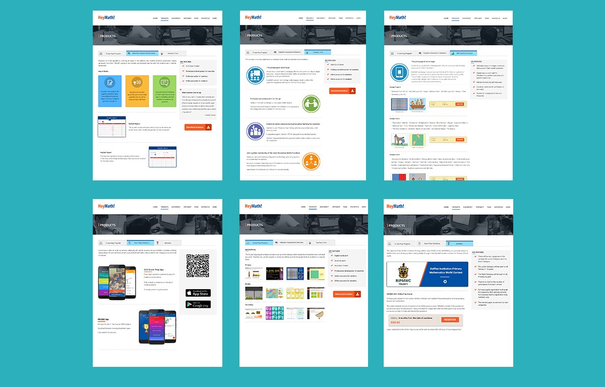
Student learning experience
Redesigned the lesson and exercise flow to reduce transition friction. Clear progress indicators, immediate feedback states, and a persistent "return to class" navigation meant students never lost their place or had to navigate back to context. The 6 friction points identified in research reduced to 2.
Outcomes
The platform redesign directly contributed to HeyMath's enterprise positioning and international expansion. Institutional clients that had previously described the product as "content-rich but presentation-weak" updated their feedback after the redesign. The visual credibility now matched the academic credibility.
Beyond metrics, this project was the moment I understood that design systems are a business strategy tool. Unifying HeyMath's visual language wasn't an aesthetic improvement — it was a sales asset, a retention tool, and a foundation for every product that came after it.
Learnings
The visual credibility of a product is indistinguishable from its actual quality — to the buyer. HeyMath's content was genuinely world-class. But a fragmented, inconsistent UI communicated "startup" when the product warranted "platform." Design is packaging. Packaging is trust.
Serving multiple segments from one interface is an architecture problem before it's a design problem. The navigation and information hierarchy work had to come before any visual decisions. Getting the structure right first saved enormous rework.
Endorsements belong above the fold. The Cambridge partnership and Friedman quote were buried in version one of the homepage. Moving them to the top half of the page was a single change that visibly shifted how enterprise visitors perceived the product on demos.
Friction in a learning product is permanent damage. Every extra click or confusing transition in an education platform trains students to disengage. Unlike a productivity tool, users don't push through frustration — they stop learning. The stakes of reducing friction were higher than anywhere else I've worked.