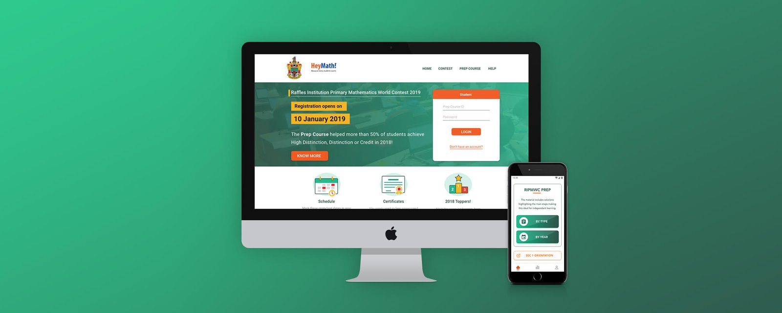
Overview
The Raffles Institution Primary Mathematics World Contest (RIPMWC) is one of Asia's most prestigious primary-level mathematics competitions. Thousands of students from Singapore, Malaysia, India, and across Asia prepare intensively for this challenge. HeyMath! was approached to build a dedicated mobile prep companion — a practice-first, competition-grade app that brought the discipline of competition maths to every student's phone.
As the designer on this project, I led the full UX and visual design — from initial concept exploration through to production-ready screens for both iOS and Android.
The Problem
Students preparing for RIPMWC and similar high-stakes competitions relied on printed practice papers, tutors, or sprawling online forums. There was no structured, mobile-first prep tool designed specifically for the competition format — timed rounds, progressively harder problems, and instant feedback.
The core tension: competition maths requires deep focus and structured difficulty progression. Mobile apps tend to reward quick dopamine hits, not sustained cognitive effort. The design challenge was to create a mobile experience that respected the intellectual rigour of the competition while making daily practice genuinely engaging.
"My child is brilliant at maths but has never done timed, competition-format practice. By the time they're in the exam hall, it's already too late to build that muscle."
Research & Discovery
Research was conducted through interviews with students (ages 10–12), parents, and competition maths tutors. We also studied how students used existing tools — printed practice books and desktop-based practice sites — to understand the current mental model.
Key findings
Parents drive adoption, students drive retention. Parents would download and install the app. If it didn't engage students within the first session, it would be deleted within 48 hours. The onboarding and first practice session had to earn both audiences simultaneously.
Timed practice is critical but anxiety-inducing. Students needed to build the ability to perform under time pressure, but naive countdown timers caused anxiety and avoidance. The solution was to surface time as coaching feedback after the fact — not as a live stressor.
Progress visibility motivates more than scores alone. Students wanted to see growth over time, not just a single performance number. Topic mastery over time was more motivating than a raw percentage.
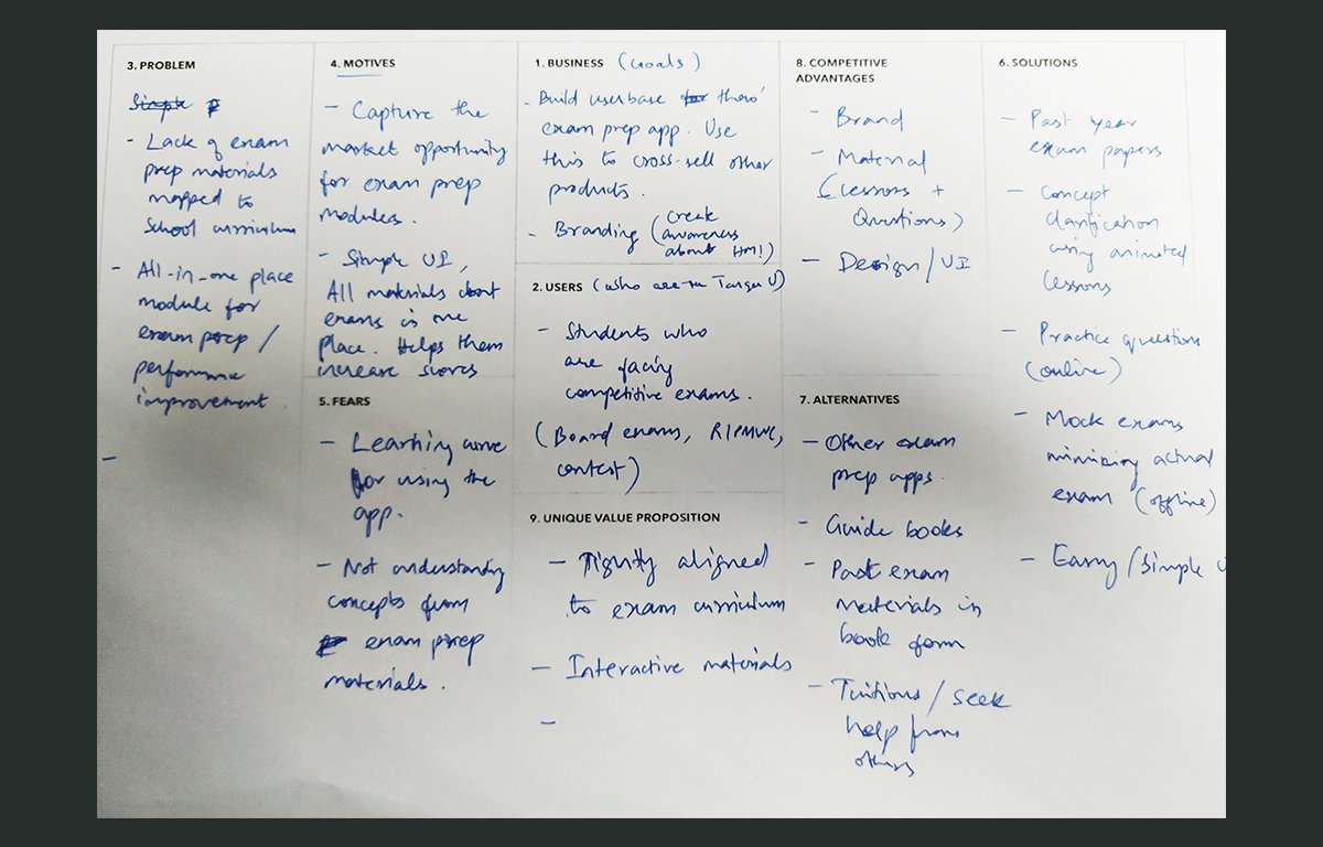
Design Execution
Practice flow
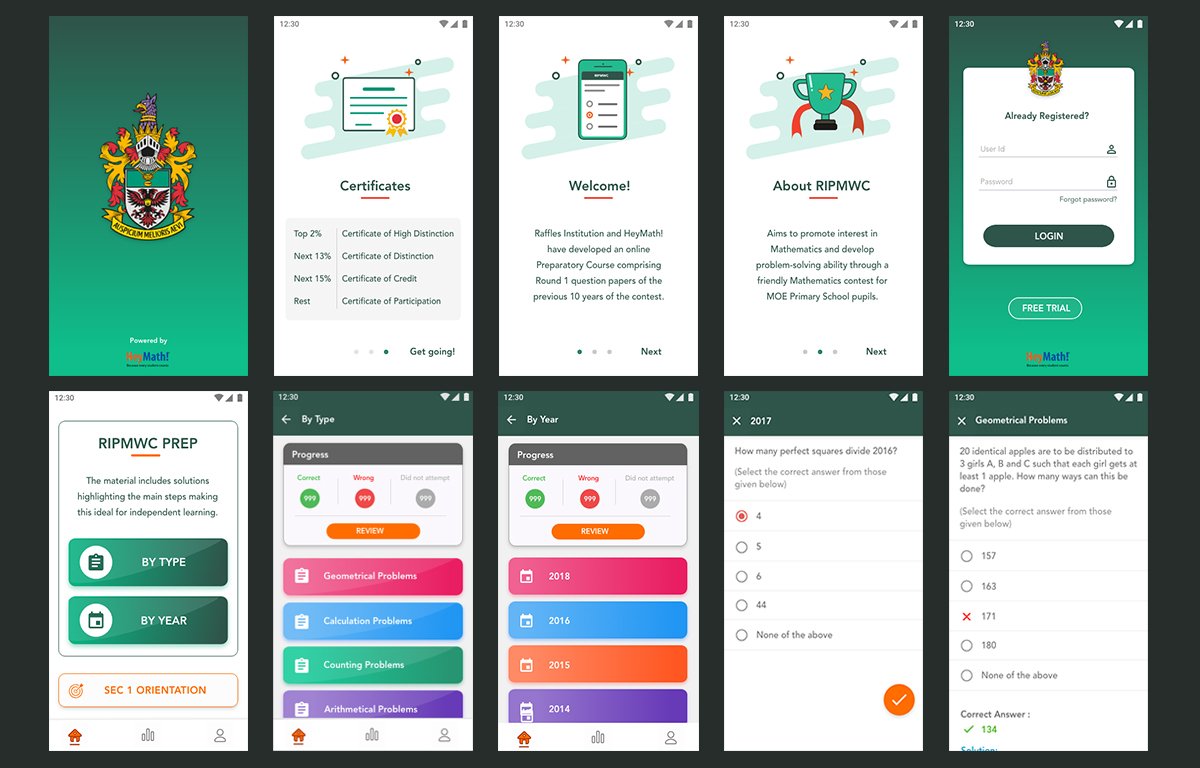
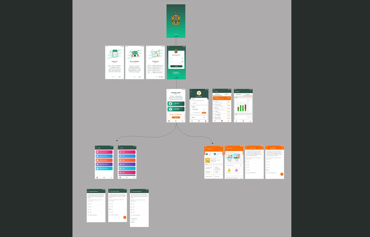
The core loop: Select a topic or "Mixed Practice" → complete a timed problem set → review answers with explanations → see performance summary. The session design mirrors competition conditions without the live pressure — students can pause and return, review explanations before seeing their score, and replay missed topics directly from the results screen.
Problem presentation
Mathematical notation on mobile is a known challenge. Built a clean typesetting system using LaTeX-inspired rendering that made complex equations legible on small screens. Answer input was designed to handle numeric, multi-step, and multiple-choice formats — each with distinct interaction patterns that reduce cognitive switching.
Progress & mastery tracking
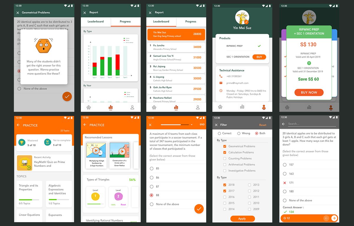
Designed a topic-level mastery grid — a visual matrix showing all competition topics with performance bands (Not started / Practising / Mastered). Students could see at a glance which areas needed work. Parents had a read-only summary view that surfaced the same data at a higher level.
Competition simulation mode
A dedicated "Competition Mode" replicated the exact format and timing of the RIPMWC paper. This mode had a distinct visual language — darker palette, no interruptions, strict timer — to prime students mentally for the real-exam context.
Web platform
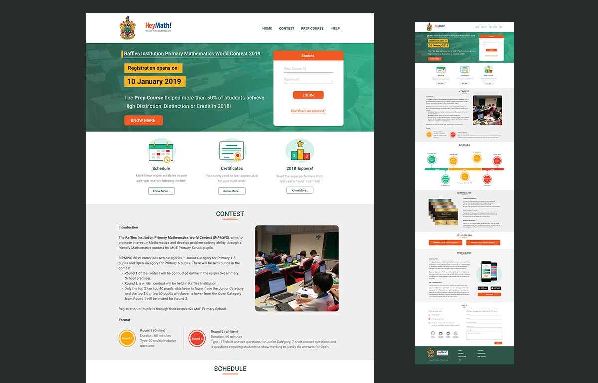
Alongside the app, I designed the full RIPMWC web platform — the competition registration site, schedule, certificates section, prep course landing page, and the 2018 Toppers showcase. The web design needed to serve both students researching the competition and schools registering their pupils, each with a different primary action.
Outcomes
The app was received positively by both the competition organiser and early test schools. Teachers reported that students who used the app regularly showed marked improvement in timed problem-solving — not just accuracy, but the composure to work under time pressure. The mastery grid became the most-used screen after the practice flow itself.
Learnings
Anxiety is a design problem, not just an emotional state. The decision to show time as feedback rather than a live countdown was the most impactful single design choice. It changed the emotional register of the entire practice experience.
Parents are users too. In consumer EdTech, the decision-maker (parent) and the end user (child) are different people with different needs. Designing for both without creating two separate products requires explicit prioritisation of which interaction belongs to each person.
Mathematical content has unique rendering requirements. Treating equation display as a first-class design concern — not an afterthought for engineering — resulted in a reading experience that felt native to the subject matter.