Overview
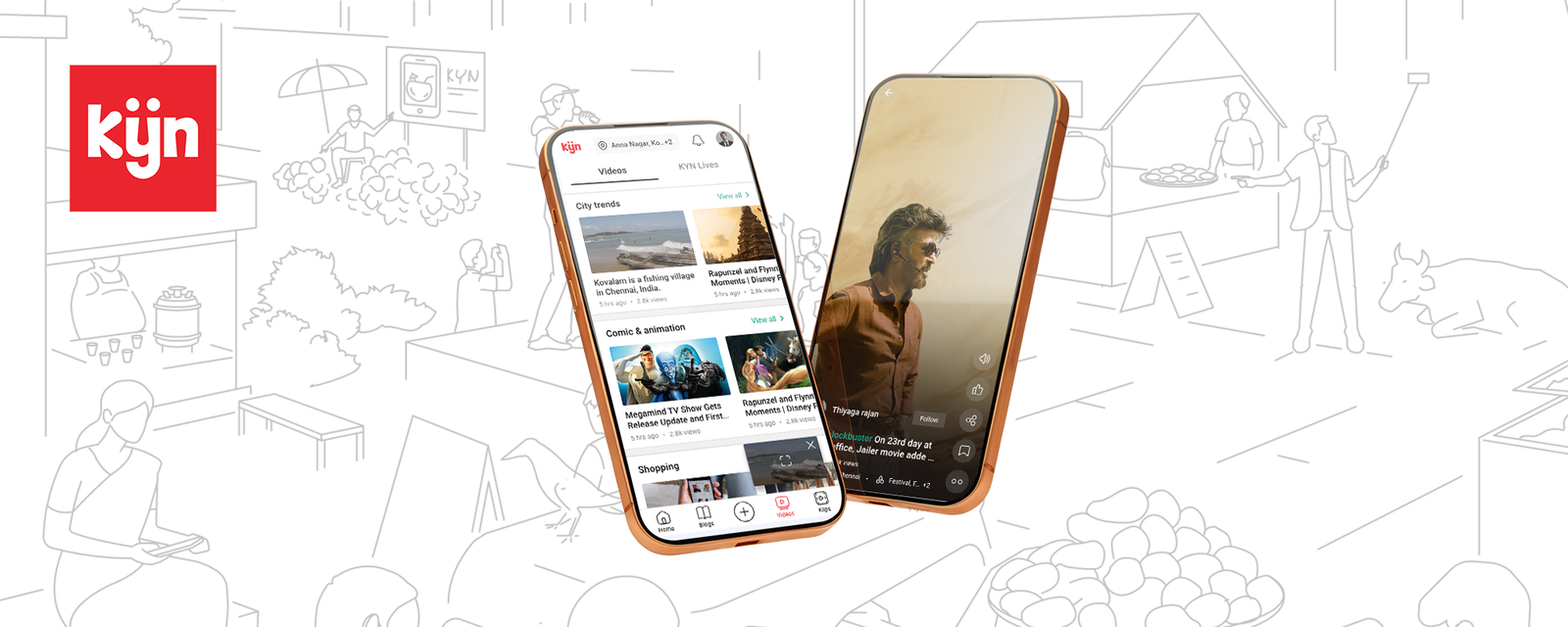
Kyn is a hyperlocal community social platform built for India — specifically designed to bring neighbourhood content, local events, community news, and short-form video together in a single app. Where global social platforms surface content from the world, Kyn surfaces content from your street, your area, your city. The tagline: "Where we belong."
As Lead Designer, I owned the full end-to-end design — from brand identity and information architecture through to every screen, interaction, the marketing website, and brand collateral. The product launched on iOS and Android, targeting urban Indian neighbourhoods starting with Chennai.
The Problem
India's social media landscape in 2023 was dominated by global platforms — Facebook, Instagram, YouTube, WhatsApp — none of which were designed with the Indian neighbourhood in mind. Local news about the new metro station opening in Anna Nagar, a live event happening in Kodambakkam, a fisherman's story from Kovalam — these never surfaced on a global feed algorithm. They lived in WhatsApp groups and word of mouth.
Kyn was built to solve this gap: a platform where hyperlocal content — defined by your neighbourhood, your city, your community — is the default, not a filter you have to apply.
"What's happening around me right now? My feeds show me everything except that."
Core design challenges
Multi-format content in one app: Kyn had to serve long-form blogs, live event streams, short-form Klips video, and community posts — all within a coherent navigation structure that didn't feel fragmented or overwhelming.
Neighbourhood identity at the core: The app needed to feel deeply local from the first screen. Every content discovery interaction had to be anchored to the user's specific area — not just Chennai broadly, but Anna Nagar, Tambaram, Kodambakkam specifically.
Building a creator economy for local voices: For Kyn to have content, it needed creators. The design had to make content creation easy for non-professional locals — and build aspirational tiers (KYNfluencer, KYN Farmer) that incentivised local participation at scale.
Competing with polished incumbents: Users arriving from Instagram, Reels, and YouTube had high visual standards. The design had to feel native-quality — not a scrappy indie app — while being built as a 0 → 1 product.
Research & Discovery
Research centred on understanding how people already consumed and shared local information — not how they used social media generally. The insight was that existing local information sharing was almost entirely push-based (WhatsApp forwards, group messages) rather than pull-based (a feed you check). Kyn had to flip this — make local content worth seeking out, not just forwarding.
Key findings
Neighbourhood pride is a strong motivator. People in Chennai are deeply attached to their specific locality — Anna Nagar, Mylapore, T.Nagar each has its own distinct identity and community pride. An app that names and celebrates these localities taps into existing social identity, not just utility.
Three distinct user motivations: Consumers (read, watch, discover local content), Creators (share stories, grow a local following), and Businesses (reach a local audience, advertise in their neighbourhood). The design had to serve all three without prioritising one so heavily that the others felt like second-class citizens.
Short-form video is non-negotiable. Post-TikTok, post-Reels, any consumer app without short-form vertical video was a hard sell. Klips — Kyn's short-form video format — had to feel as fluid and addictive as the formats users already loved, while being anchored in local content.
Information Architecture & Navigation
The core IA challenge was organising five distinct content modes into a navigation structure that felt intuitive, not bloated. The solution: a bottom tab bar with five dedicated destinations, each with a clear, distinct purpose and visual identity within the app.
The five tabs
Home: The community feed — long-form blogs, trending stories, creator posts, and community updates from within the user's selected locality. Content is filtered by area first, then interest. The locality chip (showing the user's current neighbourhood) is always visible at the top, reinforcing the hyperlocal premise on every visit.
Live: Real-time and upcoming live events in the user's neighbourhood. Tabs within Live allow users to switch between nearby localities (Anna Nagar → Tambaram → Kodambakkam) to discover events just outside their immediate area. Time-coded event cards show what's happening now versus what's upcoming.
Create (+): The content creation hub — central, prominent, always one tap away. Supports blog writing, video uploads, and Klips recording. The central position signals that Kyn is a platform for participation, not just consumption.
Videos: Category-organised video content — City Trends, Comic & Animation, Shopping, and more. Horizontal scrollable cards per category give a TV-guide-style browsing experience, allowing users to graze across content types without committing to a single feed.
Klips: Full-screen vertical short-form video, designed to feel immediately familiar to users of Reels and TikTok. Swipe-up navigation, creator attribution, location tags, and engagement actions (like, share, save, comment) follow established conventions to reduce the learning curve to zero.
Design Execution
Key screens
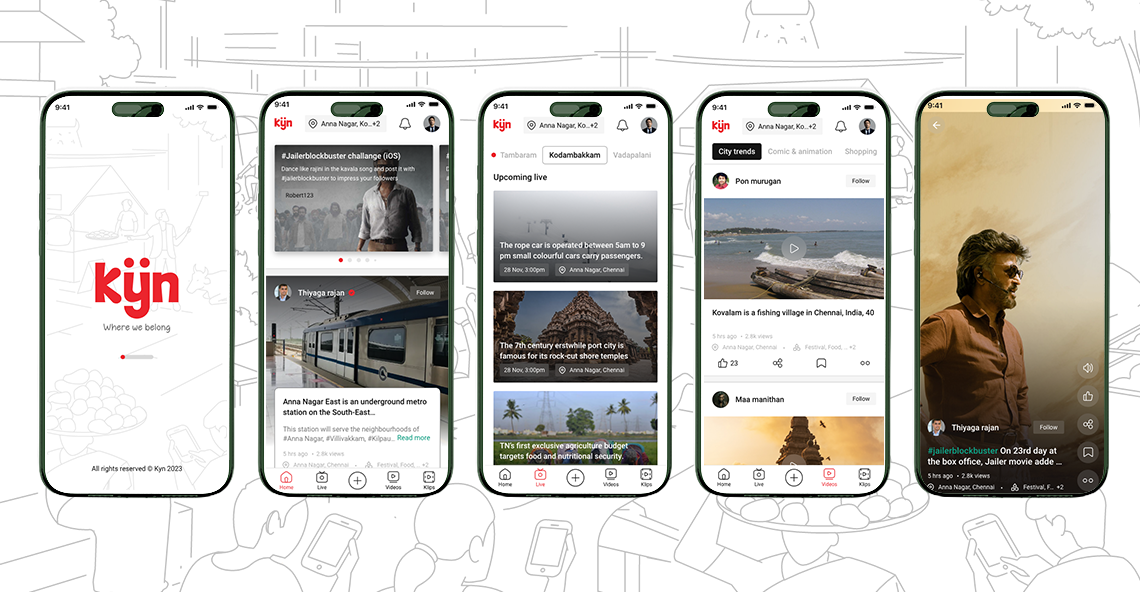
From splash to Klips, the design maintains a consistent visual language: clean white backgrounds, Kyn's signature red (#E8192C) for all primary actions and branding, and a clear typographic hierarchy that makes content — not chrome — the hero of every screen.
Splash & onboarding
The splash screen is deceptively simple — the Kyn wordmark, the tagline "Where we belong," and a subtle neighbourhood illustration on a white background. The restraint is intentional: it communicates warmth and belonging without visual noise. Onboarding asks only what neighbourhood you're in — locking in the hyperlocal premise from the user's very first action.
Home — the community feed
The home feed leads with the locality chip, making the user's selected neighbourhood explicit on every visit. Below: a featured creator story card (Thiyaga Rajan's post about the Anna Nagar East metro station), followed by a scrollable community feed. Creator cards show name, follow action, post preview, view count, location tag, and topic tags — giving enough signal to decide whether to dive in without requiring a click.
Live — neighbourhood events
The Live tab uses pill tabs to switch between localities — bringing Tambaram, Kodambakkam, and Vadapalani into direct comparison. Upcoming live events are shown as card-and-copy pairings: a thumbnail, event description, date-time, and location. This format works as both a schedule and a discovery surface — users find events they didn't know to look for.
Videos — category discovery
The Videos tab organises content into horizontal category rows — City Trends, Comic & Animation, Shopping — each with a "View all" link. The layout mimics the mental model of a TV channel guide: browse across genres before committing. Cards in each row show title, creator, view count, and time stamp, giving enough context to drive clicks without overwhelming the grid.
Klips — full-screen vertical video
The Klips player is a full-bleed vertical experience: content fills the screen, controls are overlaid with translucent treatments, and creator info appears at the bottom without obscuring the video. Right-side action buttons (volume, like, share, bookmark, more) follow the Reels convention. Location tag and topic chips sit below the creator name, grounding every Klip in its neighbourhood origin.
Creator Ecosystem Design
Kyn's community economy required a tiered creator model — a structured way to turn passive residents into active content contributors at three levels of engagement and commitment.
KYNfluencer
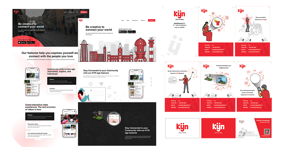
The aspirational creator tier — individuals who regularly create and share content about their neighbourhood. The "Show your talent, Become a KYN star" messaging on the KYNfluencer card targets anyone with a perspective and a phone. Designed with Bollywood-inspired confidence: bold red backgrounds, character illustrations, a business card format that feels like a credential worth showing off.
KYN Farmer
The citizen journalist tier — "Be the eyes and ears of your community." KYN Farmers are hyperlocal reporters: people who cover what's happening on their street, at their local temple, in their neighbourhood market. The design treats this role with the same seriousness as a journalist credential — a named card, a title, contact details, the Kyn brand. This isn't a casual label; it's an identity.
Business promotion
"Promote businesses in your neighbourhood." The business tier allows local shops, restaurants, and services to reach a geographically targeted audience — not through generic digital ads but through placement in the feed of the exact locality their customers live in. The card design mirrors the KYNfluencer and KYN Farmer formats, creating visual consistency across the creator economy tiers.
Web & Brand
Beyond the app, Kyn needed a marketing website and a complete brand identity system that could extend across digital and physical touchpoints.
Landing page
The web landing page opens with a full-bleed dark hero — "Be creative to connect your world" — over a illustrated city skyline that blends Indian architectural forms with a modern, line-art illustration style. The app download CTA (App Store / Google Play) is above the fold, with feature sections below communicating the platform's three pillars: community blogs, interactive video (Klips), and live events.
The white-background sections use a clean editorial layout — a feature headline, supporting copy, and an app screen mockup side-by-side. The visual rhythm alternates between text-led and visual-led sections, maintaining energy through a long-scroll page without relying on dense content.
Brand identity
The Kyn wordmark uses a rounded, distinctive letterform — the double-dot on the 'y' is the brand's signature detail, giving it a face-like quality that's warm, memorable, and instantly recognisable at small sizes. The red (#E8192C) is unapologetically bold — it commands attention in a notification tray, on a business card, or on a billboard. The brand system extends across ID cards, business cards, and creator credentials, all maintaining the same visual DNA.
Interaction Design
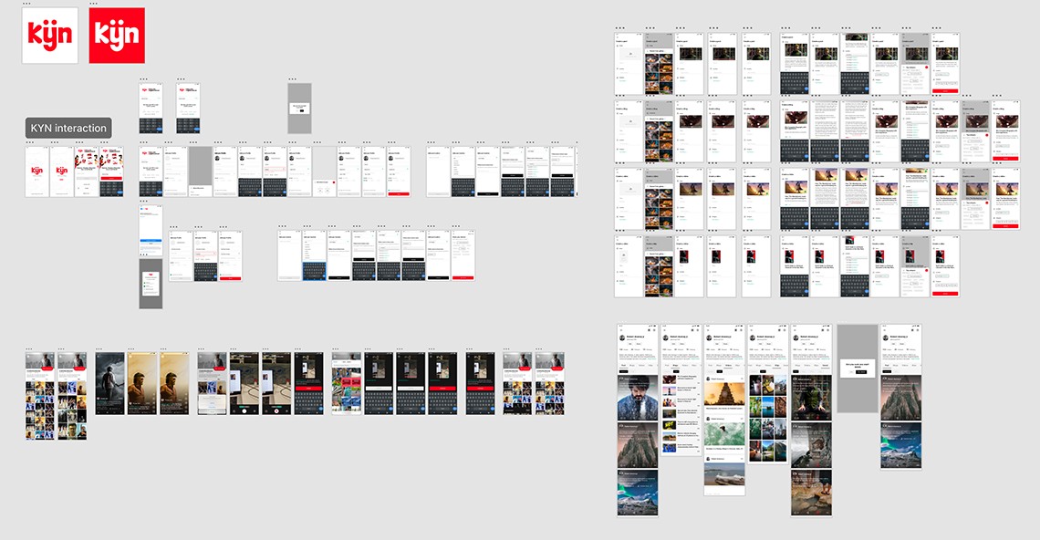
The full Kyn interaction design spans over 100 screens covering every user flow — onboarding, content discovery, content creation (blog, video, Klips), social actions (follow, like, comment, share), live event viewing, notifications, profile management, settings, and the full creator programme sign-up flows.
The interaction map was built in Figma with prototype connections linking every screen. This served two purposes: a complete handoff specification for the engineering team, and a pressure test for every navigation decision — flows that seemed logical in isolation often revealed dead ends or redundant steps only when fully connected.
Key interaction principles
Convention first, differentiation second. For core mobile interactions — swipe to dismiss, pull to refresh, tap to like, swipe up for next Klip — Kyn follows platform conventions without deviation. Differentiation happens at the content and community level, not in gesture vocabulary. Familiarity reduces the learning curve; uniqueness builds loyalty.
Locality is always one tap away. At every content screen, the user's selected locality is visible and tappable. Switching areas is never buried in settings — it's a first-class action because changing your neighbourhood context is a core part of how Kyn is used.
Creation is always visible. The create (+) button is centre-bottom on every tab — never hidden, never conditional. The decision to feature it this prominently reflects the product belief that Kyn's value grows with every new piece of local content created. Every design decision that makes creation feel easier or more accessible compounds at scale.
Outcomes
Kyn shipped as a complete, production-ready product on iOS and Android with a full web marketing presence. The design delivered a visually coherent platform that could credibly compete with established consumer apps in terms of polish and interaction quality — a significant achievement for a 0 → 1 product.
The creator economy design — KYNfluencer, KYN Farmer, and business promotion tiers — gave Kyn a structured, scalable content supply model that distinguished it from generic social platforms. The brand identity system was robust enough to extend across digital, physical, and credential touchpoints without inconsistency.
Learnings
Hyperlocal means genuinely local — not just a geo-filter. Putting the neighbourhood name in the header wasn't enough; every content discovery interaction had to feel like it was designed specifically for someone who lives in Anna Nagar or Kodambakkam. That specificity is what makes local content feel personal rather than incidental.
Multi-format apps require disciplined navigation design. Blogs, live events, videos, and Klips are genuinely different consumption behaviours. Cramming them all under a single "feed" would have forced compromises in each. The five-tab structure respected the distinctiveness of each format — users could go deep on Klips without the experience leaking into their blog reading.
Creator economy tiers need to feel like identity, not features. KYNfluencer and KYN Farmer worked as concepts because the design treated them as aspirational identities — with credentials, names, and visual gravitas — not just user roles or permission levels. People sign up to become something; the design made "becoming a Kyn creator" feel real.
Consumer apps demand production-quality finish. In a world where users have Instagram, YouTube, and Reels as the baseline, there is no acceptable excuse for rough edges. Pixel-perfect typography, precise micro-interactions, and a disciplined visual system weren't nice-to-haves — they were the table stakes to be taken seriously.