Overview
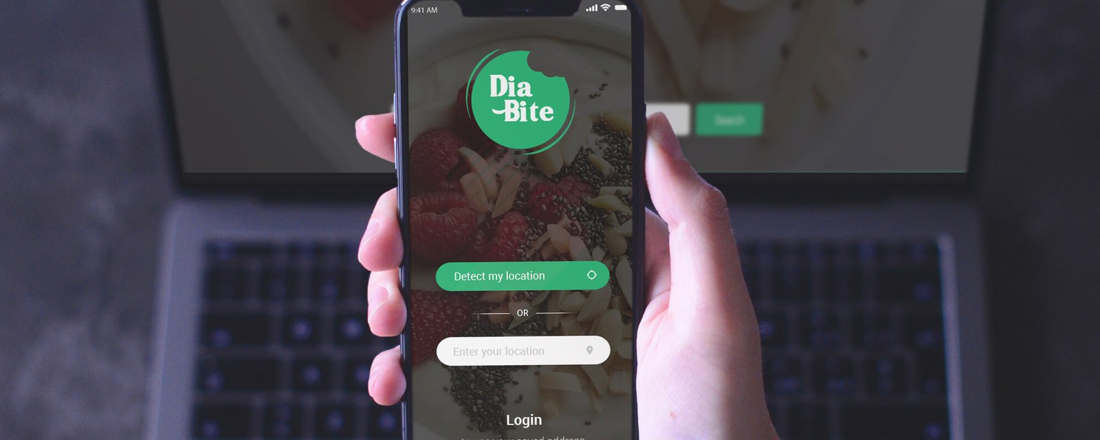
DiaBite is a food discovery and ordering app designed specifically for people managing diabetes. Unlike generic food delivery platforms, DiaBite surfaces restaurants and dishes that are safe — or appropriately adapted — for diabetic dietary requirements, combining location-based delivery with dietary intelligence.
This was a first-of-kind product: no direct precedent existed at the intersection of food delivery UX and chronic condition management. I designed the complete product — from discovery to checkout — as a zero-to-one build.
The Problem
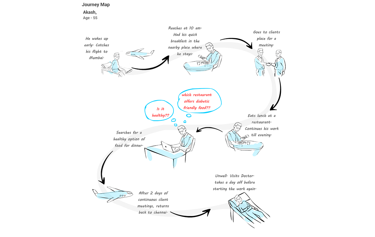
There are over 537 million adults living with diabetes globally. Eating out — or ordering in — is one of the most anxiety-inducing daily activities for this population. Standard food delivery apps offer no dietary filtering beyond broad categories like "vegetarian" or "low calorie." For diabetics, this is dangerously inadequate.
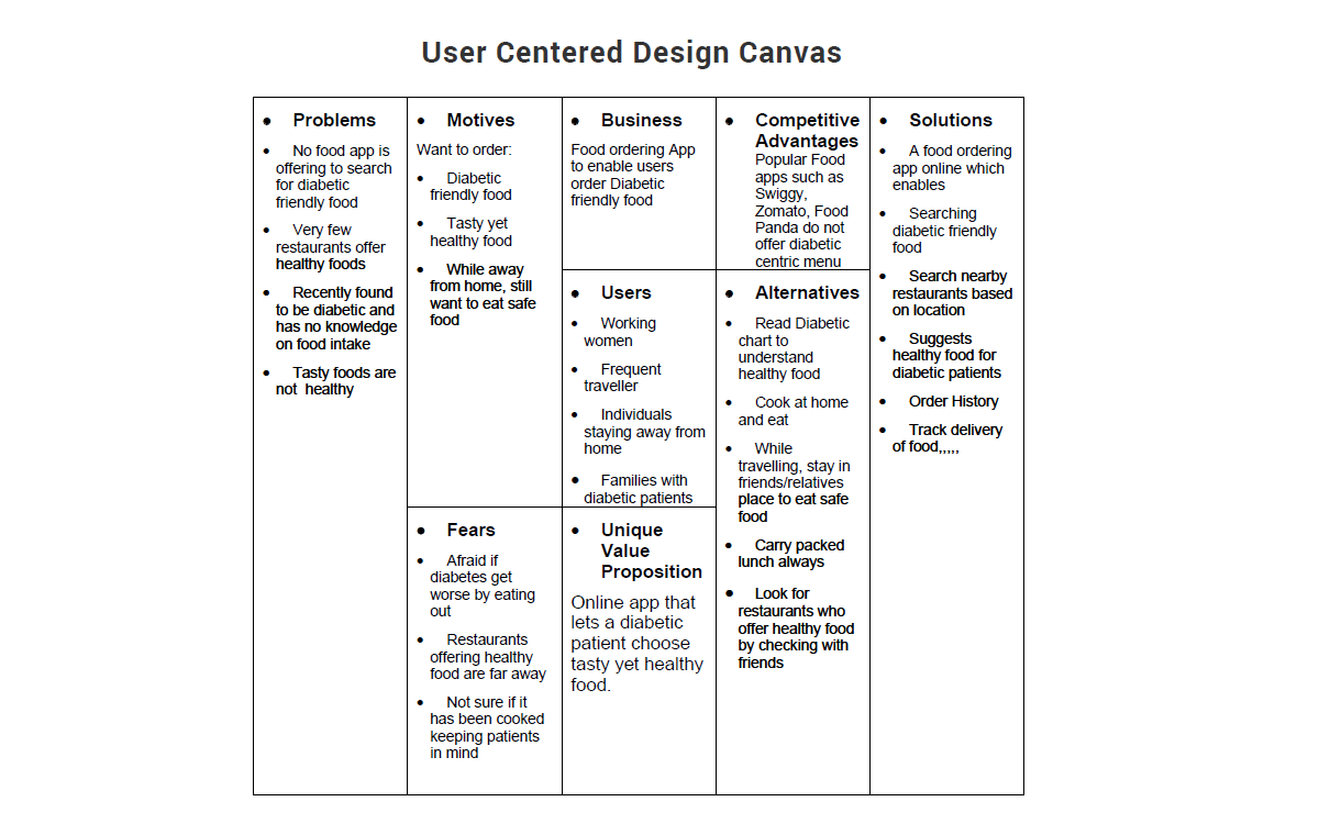
The result: diabetic users either over-restrict themselves (refusing to order delivery), or make uninformed choices that compromise their health management. Neither is acceptable.
"I want to order food like everyone else. I just need to know it's safe for me — without having to read every ingredient list myself."
Key tension
The product had to solve a health problem without feeling clinical. The risk of going too "medical" was an app that felt prescriptive, anxiety-inducing, and joyless. The risk of going too "fun" was under-serving the real health need. The design challenge was to feel safe and free simultaneously.
Research & Discovery
Research for DiaBite involved two parallel tracks: understanding the dietary science and understanding the emotional experience of eating with diabetes.
User interviews
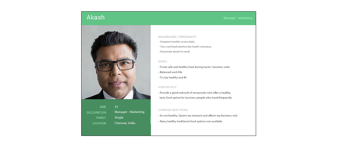
Conducted interviews with diabetic users across age groups — Type 1 and Type 2, with varying levels of dietary discipline. The consistent theme: they wanted to make their own choices. They didn't want an app to say "you can't eat this." They wanted an app to say "here's what works for you, and here's why."
Competitive audit
Reviewed Swiggy, Zomato, Uber Eats, and specialist diabetic food subscription services. The delivery apps offered zero diabetic-specific filtering. The health services were either too restrictive (pre-packaged meal kits only) or too complex (calorie/glycaemic load calculators requiring manual input). The gap was clear.
Dietary framework research
Collaborated with nutritionists to build a framework for what "diabetic-friendly" means in the context of restaurant food — glycaemic index ranges, portion guidance, ingredient substitutions. This formed the back-end tagging system that the UX surfaced through visual cues rather than numbers.
Design Decisions
Onboarding — setting up trust
The onboarding collected minimal data: diabetes type, dietary preferences, and location. No medical questionnaire, no complex setup. The framing was deliberately positive: "Tell us how you eat best." This set the tone — DiaBite is for your freedom, not your restrictions.
Location-based discovery
The home screen opened with location detection and a curated list of nearby restaurants with DiaBite-verified menus. A clear "DB Approved" indicator on listings replaced the need for users to scan ingredient lists. Trust through curation, not information overload.
Dish-level intelligence
Within each restaurant, dishes were tagged with simple, readable indicators: "Low GI," "Portion-adjusted," "Swap available." Not raw numbers — actionable language that respected the user's intelligence without demanding nutritional expertise.
Visual language
Chose a warm green palette — evoking freshness and health without clinical coldness. Photography-forward UI borrowed from premium food delivery aesthetics, signalling that DiaBite was about good food first. The health layer was an enhancement, not the headline.
Key Screens

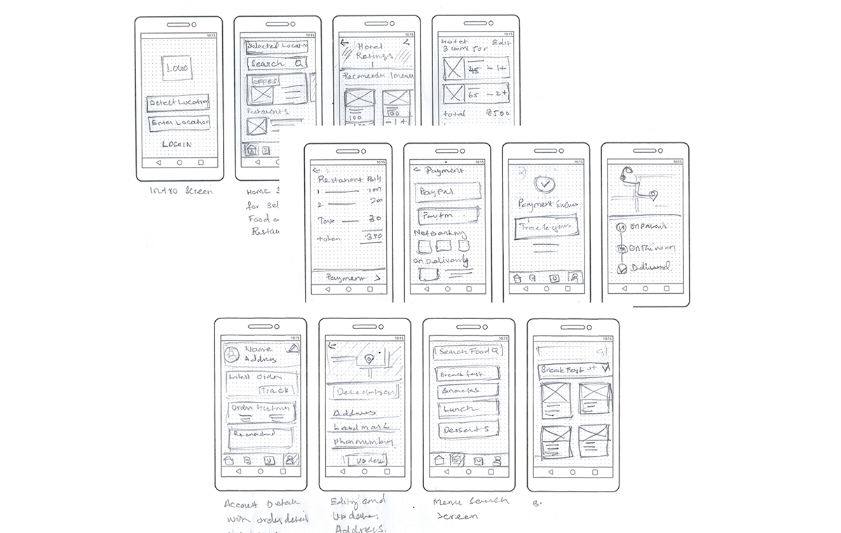
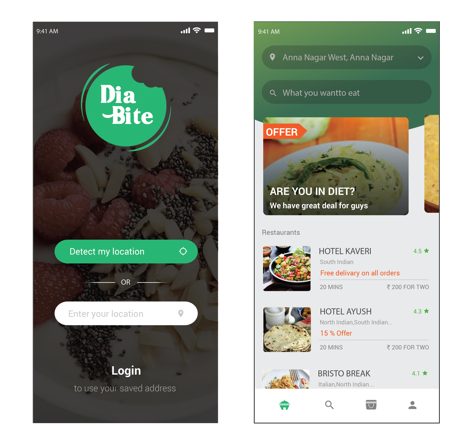
Outcomes
DiaBite was delivered as a complete, production-ready design — all screens, states, interactions, and handoff documentation. The product represented a genuinely new category of mobile experience: dietary-intelligent food delivery.
Learnings
Health UX must feel human, not clinical. The biggest risk was designing an app that felt like a medical device. Every copy, colour, and interaction choice was reviewed through the lens of: does this feel empowering or constraining? Empowering won every time.
Curation beats configuration. An early concept included a glycaemic calculator for custom meals. Testing showed users abandoned it immediately. They wanted the app to do the thinking for them. Removing complexity was the design work.
First-of-kind means no wrong answers. Without existing patterns to reference, every screen was an invention. This was creatively liberating but required much heavier validation — every assumption needed testing because there was no baseline to borrow from.
Food is emotional. Eating out represents freedom and social connection for diabetics in a way it doesn't for the general population, because they're so often excluded from it. Designing for that emotional context — not just the functional ordering task — was what made DiaBite feel different.