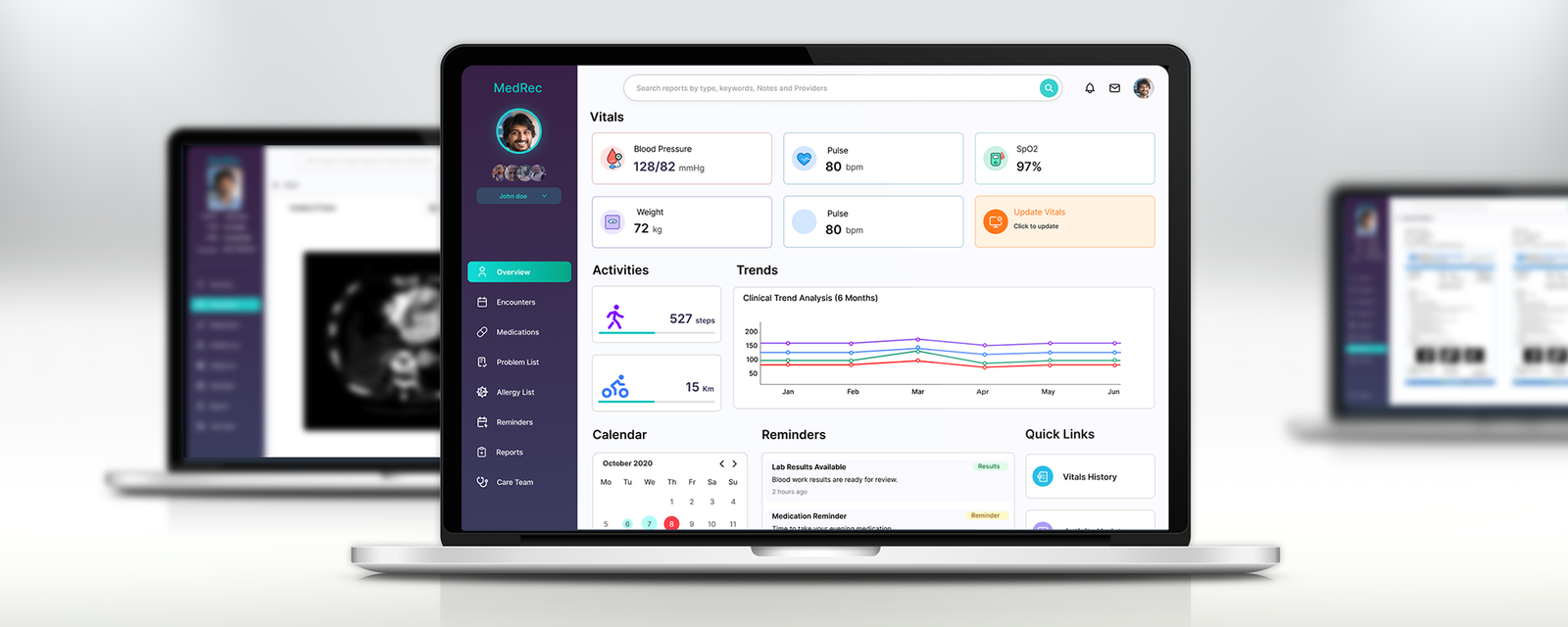
Overview
MedRec is a patient-facing personal health records platform — a single place where people managing ongoing health conditions can track their vitals, view clinical reports from multiple providers, manage their medications and conditions, and monitor their health trends over time. The platform delivers a unified web dashboard and a companion iOS app, giving patients access to their complete health picture from any device.
As Lead Designer, I owned the full design — information architecture, all interaction patterns, the complete screen set for web and mobile, and the visual design system. The challenge was to make genuinely complex medical data feel clear and manageable, without dumbing it down for patients who are sophisticated about their own health.
The Problem
People managing chronic conditions — hypertension, diabetes, coronary artery disease — typically have health data scattered across multiple providers, labs, imaging centres, and hospital systems. A cardiac CT scan from one imaging centre, a blood report from a different lab, and a prescription history from a GP are all relevant to the same patient — but they live in three separate paper files or three different patient portals that don't communicate.
MedRec was built to solve this fragmentation. Not a hospital system, not a clinical EMR for doctors — a patient-owned health record that aggregates what matters and presents it in a way patients can actually understand and act on.
"I have reports from three different labs and two hospitals. By the time I get to my appointment I can never find what the doctor needs."
Core design challenges
Medical data is dense and heterogeneous. Blood pressure readings, CT scan PDFs, medication schedules, and diagnosed conditions are structurally completely different. Designing a visual system that handles all of them consistently — without collapsing their differences or overwhelming users with clinical complexity — required deep information hierarchy work.
Reading vs. writing workflows live on the same screen. Patients needed to both review existing data (read-heavy: browsing reports, checking trends) and add new data (write-heavy: logging vitals, uploading encounters, adding medications). These workflows required different interaction patterns that had to coexist without confusion.
Multi-patient context. Families managing health records for elderly parents, or caregivers managing records for multiple dependants, needed the ability to switch patient context cleanly without risking accidental data cross-contamination.
Parity across web and mobile. The web dashboard and the iOS app needed to feel like one product — not a simplified mobile "lite" version. Key workflows — particularly report viewing, vitals updating, and encounter logging — had to be fully functional on iOS, not deferred to the desktop.
Research & Discovery
Research centred on understanding how patients with ongoing health conditions currently managed their records — and where the friction was highest. The consistent finding across interviews: patients were not disorganised by choice. They were disorganised by necessity, because no tool had been designed to help them be otherwise.
Key findings
Reports are the highest-stakes content. Imaging reports (CT scans, MRIs, X-rays) and lab results were the data patients most needed to access quickly — in doctor's appointments, in emergencies, or when getting a second opinion. Report viewing and upload were therefore the two most critical workflows to get right.
Trends matter more than single readings. A blood pressure reading of 128/82 is context-free. Seeing it plotted alongside six months of previous readings — colour-coded by vital type — gives a patient genuine insight into whether things are improving, stable, or worsening. Trend visualisation was not a secondary feature; it was a primary clinical value driver.
Data entry must be frictionless to be consistent. Patients who had to fill in long forms to log a vitals reading simply didn't. The input pattern had to be as fast as possible — pre-filling everything that could be inferred, minimal required fields, immediate feedback, and a one-tap entry point from the overview.
Comparison is a real workflow. Patients getting serial imaging — follow-up CT scans, repeat blood work — needed to compare reports side by side to track change over time. This wasn't an edge case; it was the standard workflow for chronic condition management.
Information Architecture & Structure
The core IA decision was to organise the platform around clinical record categories — not around time (a journal model) or around providers (a per-doctor model). Records are always available in their canonical category: all medications together, all encounters together, all reports together — regardless of which provider or system they originated from.
The eight modules
Overview serves as the health dashboard — the single-screen summary that gives a patient their current status at a glance. Vitals (with an "Update Vitals" CTA), daily activity metrics, a six-month multi-vital trend chart, calendar, reminders, and quick links all live here. This screen was designed to answer "how am I doing right now?" in under ten seconds.
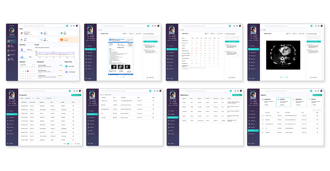
Encounters is the log of all clinical visits — doctor consultations, diagnostic procedures, hospitalisations. Each encounter links to its associated reports, making it the entry point for viewing any clinical document in context. The encounters list is searchable and filterable by date, visit type, provider, speciality, and status.
Reports is the report library, tabbed by type: Laboratory, Imaging, Diagnostic, and Clinical. Within each tab, reports are listed chronologically and can be opened as full-document views. The report comparison feature allows any two reports to be placed side by side — essential for tracking change over time in serial imaging.
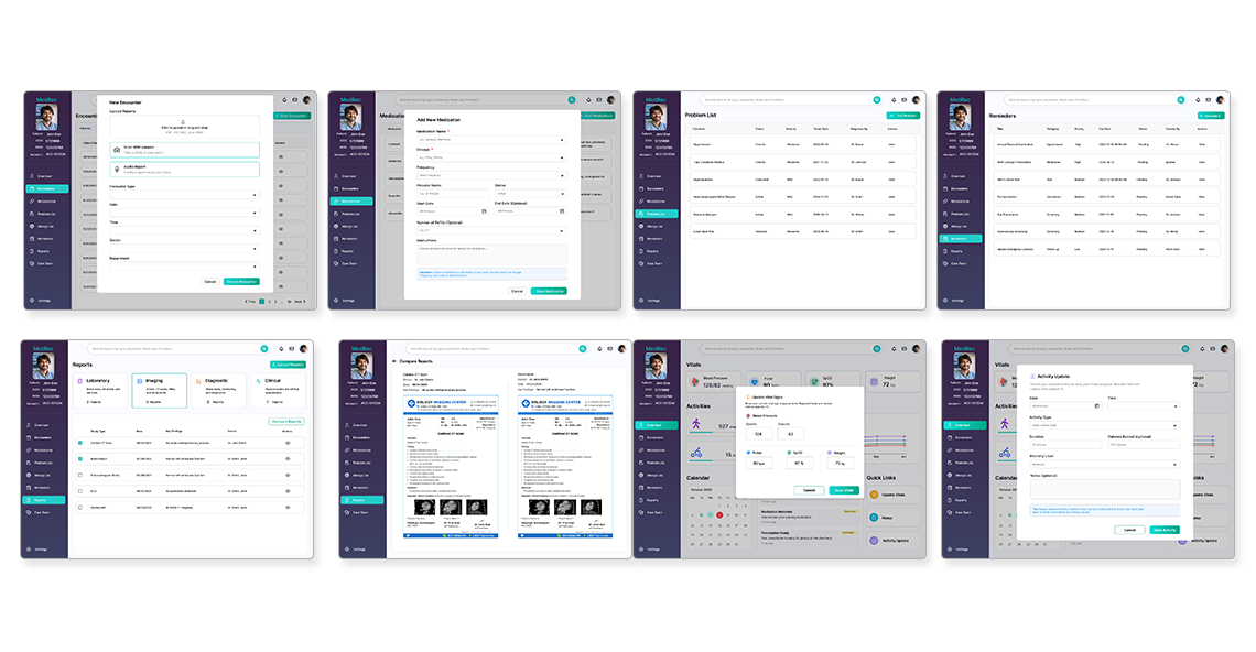
Medications tracks active and historical prescriptions — medication name, dose, frequency, prescriber, and date range. Adding a new medication is a single modal form, designed to be completable in under 30 seconds.
Problem List surfaces all diagnosed conditions in a structured list — condition name, clinical status, severity, onset date, diagnosis date, and managing provider. This gives both patients and any provider they share records with an instant summary of the patient's complete health history.
Reminders handles time-sensitive health actions: medication schedules, lab result follow-ups, upcoming appointments. Reminders appear in the overview panel and as a dedicated module for full management.
Allergy List and Care Team round out the record — the allergy list is critical for safe medication management, and the care team directory gives patients a single-place record of every provider involved in their care.
Design Execution
Overview dashboard — the health pulse
The overview is the most-visited screen and the hardest to design — it had to present genuinely dense information without feeling clinical or overwhelming. The solution: card-based tiles for each vital with clear value-and-unit typography, an "Update Vitals" CTA in a warm amber tile that draws the eye without being alarming, and a clinical trend chart that plots all vitals on the same axis with colour coding for instant differentiation. Below the fold: a monthly calendar view and a reminders feed that surfaces only the most time-sensitive actions.
Encounters & reports — the clinical record
Encounter detail screens load the full context of a visit: patient demographics, encounter metadata, linked reports, and provider comments — all in a structured three-column layout. Reports open as full-document views with report imagery (CT scans, ultrasound images) rendered inline. The provider comments panel on the right allows clinicians or patients to annotate any report without modifying the source document.
The report comparison screen places two reports side by side in a scrollable split view — key findings extracted and surfaced at the top for fast reference, with the full source documents scrollable below. This design respects the fact that patients comparing serial reports are looking for differences, not reading from start to finish.
Data entry modals — fast and forgiving
Every data creation action — new encounter, add medication, update vitals, log activity — uses a focused modal that overlays the current context rather than navigating away. This keeps users oriented in the record they were already reviewing. Modals are deliberately short: only the fields genuinely required, with sensible defaults pre-filled wherever possible. Encounter upload supports three entry methods — file upload (PDF, JPG, DOC), camera scan, and audio report — accommodating users at every level of technical comfort.
Visual design system
The visual language balances clinical precision with approachability. A white background with teal (#00C5B5) primary actions and deep purple left sidebar keeps the interface clean and calm — neither as cold as traditional clinical software nor as casual as a consumer wellness app. This is the emotional register of a tool that takes your health seriously without making every interaction feel like a hospital visit. Icon-led navigation labels and colour-coded vital tiles give rapid visual orientation across a complex information space.
Problem list & medications — clarity in structured data
The problem list and medications screens are the most data-table-heavy in the application. Design decisions here focused on scannability: consistent column widths, clear status indicators (Active / Chronic / Resolved), zebra-row shading for dense lists, and inline action menus that keep the table clean until needed. The add/edit actions are surfaced as persistent CTAs in the header — never buried in row-level menus where they'd be hard to discover.
iOS Mobile App
The iOS companion app was designed for the workflows patients most needed on mobile: checking vitals, browsing reports before a doctor's appointment, comparing results, and logging a new encounter. The mobile design is not a reduced version of the web — it is a restructured version, adapted to the context in which patients use their phones to manage health.
Mobile vitals — the health snapshot
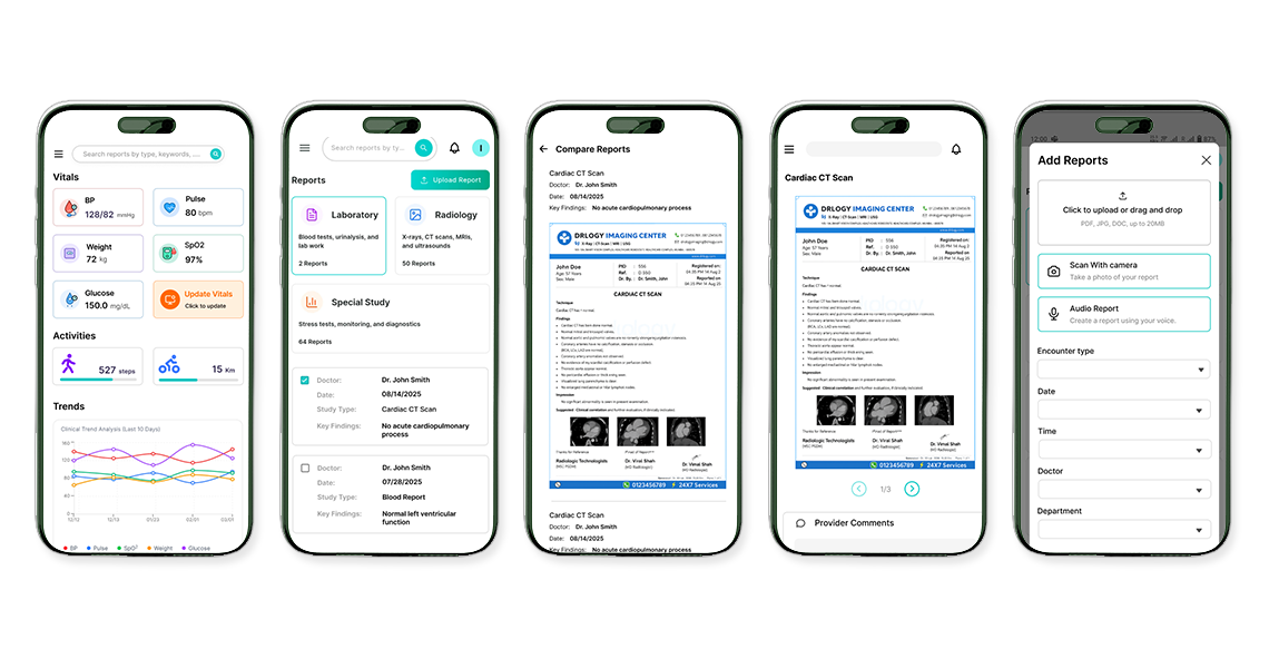
The mobile overview condenses the desktop's card grid into a vertically scrolling layout — BP, Pulse, SpO2, Weight, and Glucose as compact tiles, Activity as a two-metric row, and a sparkline-style trend chart below. The entire vitals picture fits above the fold on a standard iPhone, matching the use case: a quick check before an appointment or after a reading.
Mobile reports — document-first
The reports screen on mobile leads with category tiles (Laboratory, Radiology, Special Study) showing report counts at a glance. Tapping into any category surfaces a chronological list. Reports open as full-screen document views, rendered as scrollable pages with zoom support — critical for reading CT reports or lab tables that contain dense text and imagery.
Report comparison on mobile
Bringing the comparison feature to mobile required a deliberate layout rethink. On desktop, two reports sit side by side. On a phone, a vertically stacked approach was used — the two reports are listed with their key findings extracted to the top of the screen, and users can scroll between full-document views. This preserves the cognitive goal of comparison (find the difference) without requiring pinch-zoom navigation on a split-screen too small to be useful.
Add reports — three entry modes
Adding a report from mobile supports the same three methods as web — file upload, camera scan, and audio report — adapted for mobile-native interactions. Camera scan launches the device camera with a document overlay guide. Audio report opens a voice recording interface with a waveform display. Both entry modes were designed to be completable in under a minute from a hospital waiting room, which is where most patients would be using them.
Outcomes
MedRec was delivered as a complete, production-ready design — the full web platform and iOS companion app, all interaction states, data entry modals, empty states, and error handling. The design system is comprehensive enough to support ongoing feature development without per-screen design consultation.
The report comparison feature — a technically and conceptually challenging interaction — became a differentiating capability: no comparable consumer health record product offered side-by-side report comparison as a first-class, purpose-designed feature. The three-mode report entry system (upload, scan, audio) lowered the barrier to record completeness for users at all levels of technical comfort.
Learnings
Medical data is only dense if the design makes it so. The same clinical data — vitals, trends, lab values — can feel overwhelming in a table or clear and actionable in a well-designed card. The design's job in healthcare is to reduce cognitive load, not increase fidelity at the expense of comprehension.
Trust requires visual precision. In a health context, design sloppiness — misaligned values, ambiguous labels, inconsistent units — doesn't just look bad. It raises doubt about whether the data itself is accurate. The visual design system had to be impeccably precise to earn the level of trust that health data requires.
Modals beat navigations for data entry in record-centric apps. Every time a data entry action navigated away from the record context, users lost orientation. The modal-first approach for all creation actions — new encounters, add medications, update vitals — kept users in context and consistently resulted in faster task completion.
Mobile parity means workflow parity, not screen parity. The iOS app doesn't reproduce every desktop screen — it reproduces every desktop workflow that patients actually need on mobile. The distinction matters: designing for workflow means the mobile experience can be genuinely excellent at the things it does, rather than mediocre at everything.
Comparison is a clinical pattern, not a feature. The report comparison design revealed a broader principle: patients managing chronic conditions are always comparing — comparing against their own history, against targets, against previous results. Every screen that shows health data should consider the question "compared to what?" as a first-class design requirement.