Overview
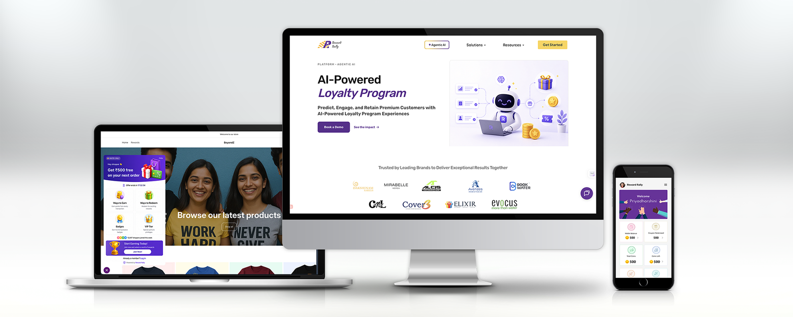
Reward Rally is an agentic AI-powered B2B loyalty platform that helps e-commerce brands predict, engage, and retain premium customers through personalised loyalty programme experiences. The platform spans three distinct products: an embeddable loyalty widget that lives inside merchant storefronts, a mobile consumer app for shoppers to manage and redeem their rewards, and an employee recognition platform for internal team motivation. A full marketing website ties the commercial layer together.
As Lead Designer, I owned end-to-end design across all three products — the complete product information architecture, the loyalty wizard widget UX, the mobile consumer app, the marketing website, and the visual design system used across the platform. Reward Rally is trusted by brands including KISNA, Cover3, Elixir, Evocus, and Avenzee.
The Problem
E-commerce loyalty programmes in India were either too generic (earn-and-burn points with no intelligence) or too complex (requiring expensive enterprise integrations that small and mid-size brands couldn't afford). The result: high customer acquisition costs with no mechanism to turn first-time buyers into loyal, high-value repeat customers.
On the employee side, team recognition in growing Indian startups and D2C brands was informal, inconsistent, and invisible — a "well done" in a Slack thread that disappeared within hours and had no lasting motivational impact.
Reward Rally was built to solve both. An AI layer predicting which customers were at risk of churning — and automatically triggering personalised rewards before they left — was the core differentiator. The design challenge was to make this AI intelligence feel seamless and actionable, not opaque or overwhelming.
"We spend ₹800 to acquire a customer who buys once and never comes back. There's no mechanism to change that."
Core design challenges
Three products, one design system. The loyalty widget, mobile app, and marketing website all needed to feel like parts of the same brand — while serving radically different user contexts. A merchant configuring their loyalty programme, a shopper redeeming a Tanishq gift card, and an enterprise buyer reading a blog about AI retention all had to encounter consistent visual and interaction DNA.
The widget is always a guest. The embeddable loyalty widget appears inside a merchant's existing storefront — it is never the primary UI. It had to be compact, visually distinct enough to be noticed, but adaptable enough not to clash with any host store's design. It also had to communicate significant programme complexity (coins, badges, VIP tiers, referrals, coupons) within a space roughly the size of a chat window.
Making AI feel trustworthy, not opaque. Reward Rally's agentic AI layer was its primary differentiator — but AI-driven decisions (personalised rewards, churn predictions, targeted campaigns) are only valuable if merchants trust them enough to act on them. The design had to make AI intelligence transparent and credible, not a black box.
Coin economics need to be instantly legible. For consumers, the core loop — earn coins on purchases, redeem for vouchers and gift cards — sounds simple. In practice, multiple coin types (wallet balance, coupon coins, total coins, coins left, recognition coins, milestone coins) need to be distinguishable without requiring a manual. The mobile dashboard had to surface this complexity clearly at a glance.
Research & Discovery
Research ran across two tracks simultaneously: understanding merchant needs (what loyalty programme mechanics drive repeat purchase?) and consumer behaviour (how do Indian online shoppers actually engage with rewards?).
Merchant research
Merchants want outcomes, not features. Every merchant interviewed could describe their problem — "customers buy once and disappear" — but few had the vocabulary to request specific loyalty features. The design had to translate feature complexity (VIP tiers, referral programmes, badge gamification) into business outcomes language: retention rate uplift, repeat purchase frequency, average order value increase. This shaped the entire marketing website's copy architecture.
Integration anxiety is the #1 blocker. Small and mid-size e-commerce brands had been burned by complex SaaS integrations before. The design needed to communicate "simple to set up" at every touchpoint — from the website onboarding flow through to the loyalty wizard configuration experience.
Consumer research
Coins are only motivating if they feel real. Shoppers who had been burned by loyalty programmes that expired, had restrictive redemption rules, or felt "fake" were sceptical by default. The mobile app's wallet design had to feel like a real account with real value — not a gamification layer designed to be difficult to redeem.
Gift card redemption is the moment of truth. The redemption journey — browsing available vouchers, selecting one, entering details, confirming the order — was where shopper trust was won or lost. Any friction, ambiguity, or delay in this flow destroyed confidence in the entire programme.
Information Architecture & Product Structure
Before any screens were designed, the full product information architecture was mapped — a comprehensive sitemap covering every module across all user roles: merchant admin, consumer shopper, and employee recognition user.
The IA spans 10+ primary modules: Dashboard, Profile, Manage Points, Points/Rewarding rules, Earn Campaigns, App Campaigns, Customer Coupons, Cart Panel integration, Challenges and Rewards, App Panel settings, Points Integration, and Subscription management. Each module branches into full user flows — the complete sitemap documents every screen, decision point, and state transition across the product.
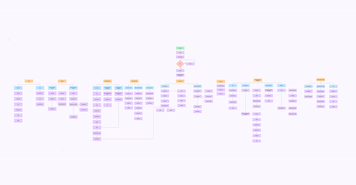
The architecture was deliberately designed around the merchant's operational mental model rather than the technical data model. Merchants think in terms of campaigns, customer tiers, and rewards — not in terms of API endpoints and configuration tables. Every navigation decision in the merchant admin mapped to a business action, not a system function.
Loyalty Widget — The In-Store Experience
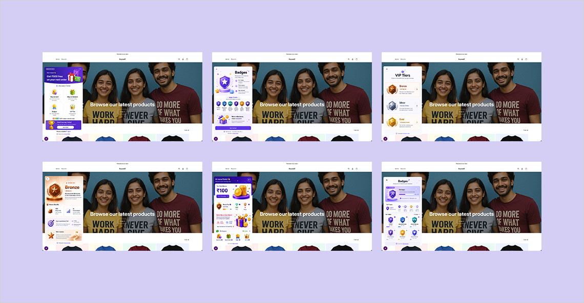
The loyalty wizard is the consumer-facing face of Reward Rally — an embeddable panel that appears within merchant storefronts and gives shoppers a live window into their loyalty status, available rewards, and programme mechanics. It had to do everything a full loyalty app would do, in the footprint of a browser panel.
Widget home — the loyalty dashboard
The default widget state surfaces the highest-value information first: the personalised offer ("Get ₹500 free on your next order"), followed by Ways to Earn and Ways to Redeem as expandable sections, and then Badges and VIP Tier as visual status indicators. A "Start Earning Today" CTA with a join count ("12,847 shoppers joined this week") creates urgency and social proof within the widget itself.
VIP tiers — aspiration by design
The VIP tier system (Bronze → Silver → Gold) is designed to feel like a genuine status hierarchy — not a feature list. Each tier card shows the tier name, a premium 3D icon, benefits summary, and an unlock condition. The visual treatment escalates in warmth and perceived value from Bronze to Gold. Shoppers at Bronze see Silver directly above them — a deliberate aspiration trigger that drives engagement without being heavy-handed.
Badges — gamification with purpose
Badges serve the gamification layer — achievements shoppers earn for behaviours beyond purchasing (reviews, referrals, social sharing, milestones). Each badge is a distinct 3D icon with a clear name and earn condition. The badge progress screen shows how far a shopper is from the next achievement — keeping the gamification loop active even between purchase sessions.
Coin explainer — removing friction at the entry point
First-time programme joiners needed to understand the earn rate instantly. The coin popup — "₹100 = 100 Coins" — communicates the core exchange rate in a single line. Below it: a mini-list of all earn actions (make purchases, write a review, complete profile, share on social, refer a friend). This screen was designed to appear at the moment a shopper is considering whether to join — it had to be persuasive in under ten seconds.
Mobile Consumer App
The Reward Rally mobile app gives shoppers a dedicated home for their loyalty balance, redemption history, available vouchers, and coin activity — independent of any specific merchant's storefront. It serves loyal shoppers who engage with Reward Rally across multiple brands.
Wallet dashboard — the loyalty home
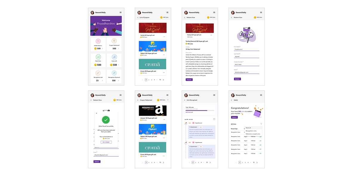
The home screen greets the user by name with a personalised banner, then surfaces six key coin metrics in a 2×3 tile grid: Wallet Balance, Coupon Redeemed, Total Coins, Coins Left, Recognition Sent, Recognition Received. Each tile is tappable, leading to the full detail view for that coin type. This layout was tested against multiple alternatives — the grid approach beat a single balance number because it made the programme's multiple reward types legible at a glance without requiring navigation.
Coupon redemption — the trust-critical flow
The redemption journey was designed for maximum clarity and minimum anxiety. Coupons are listed as branded cards (Tanishq, Flipkart, Amazon, Croma) with coin costs visible on each. Detail screens show the full redemption description before any commitment is required. The redemption form collects only what's needed — name, contact, email — and the confirmation state ("Order Placed Successfully") is immediate and unambiguous, showing the coin deduction and remaining balance in the same screen.
Recognition & coin history
The coin recognition feed surfaces peer-to-peer recognition events as a social feed — who gave recognition, to whom, when, and what message accompanied it. This feed makes the recognition programme feel social and visible, not transactional. The wallet tab provides a complete ledger of all coin activity — Recognition Coins, Milestone Coins, earned and spent — with date, time, and direction indicators for each event.
Marketing Website
The Reward Rally marketing website serves the commercial layer — converting e-commerce brand owners and HR decision-makers into paying customers. The site needed to communicate the AI differentiation, establish credibility with the brand roster, and make the complexity of the platform feel achievable rather than overwhelming.
Homepage — AI-first positioning
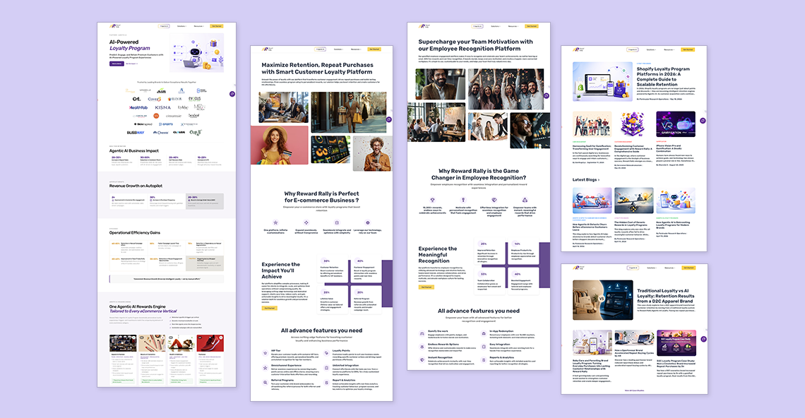
The homepage opens with the platform's core value proposition — "AI-Powered Loyalty Program. Predict, Engage, and Retain Premium Customers" — anchored by a branded AI robot illustration and the "Agentic AI" badge that signals the product's technical differentiation. Below the fold: a trust strip of brand logos, followed by Agentic AI Business Impact metrics (25–35% improvements across key retention KPIs), a Revenue Growth module, and Operational Efficiency Gains data — all with specific numbers rather than vague claims. The "One Agentic AI Rewards Engine Tailored to Every eCommerce Vertical" section shows the platform's breadth across fashion, beauty, jewellery, food and beverage, and wellness categories.
E-commerce solution page
The e-commerce page leads with an outcome headline — "Maximize Retention, Repeat Purchases with Smart Customer Loyalty Platform" — and builds the case through a "Why Reward Rally is Perfect for E-commerce Business?" feature section. Impact metrics (35%+ retention rate, 40% repeat purchase rate) are presented as visual stat cards, not buried in copy. The full features list — VIP Tier, Loyalty Points, Referral Programs, Badges, Reports & Analytics — uses an icon-led grid that communicates comprehensiveness without overwhelming.
Employee recognition page
The employee recognition section repositions Reward Rally for an entirely different buyer — HR and team leads at growing companies. The headline "Supercharge your Team Motivation with our Employee Recognition Platform" and the photo grid of diverse team moments shift the emotional register from e-commerce transactional to human and aspirational. The "Why Reward Rally is the Game Changer in Employee Recognition?" section uses the same structural template as the e-commerce page but with recognition-specific metrics and language, maintaining visual consistency while serving a different audience.
Blog & resources
The blog section was designed to serve two functions: SEO-driven content discovery and pre-sales education. Post cards show title, category, estimated read time, and a featured image. The editorial design is clean and publication-quality — signalling that Reward Rally is a thought leader in loyalty and retention, not just a software vendor.
Outcomes
Reward Rally launched as a complete product across all three surfaces — the embeddable widget, mobile consumer app, and marketing website — with a unified visual identity and consistent interaction patterns. The platform is trusted by brands across fashion, jewellery, beverages, and wellness verticals.
The AI positioning — "Agentic AI" for loyalty — differentiated Reward Rally from commodity earn-and-burn programmes in a crowded market. The design system built for the platform is consistent enough to extend into new verticals (the employee recognition expansion being the first) without requiring a redesign of core components.
Learnings
A widget is a product within a product. Designing the loyalty wizard forced a level of information hierarchy discipline that full-screen design rarely requires. When you have the space of a chat window to communicate a complete loyalty programme, every word, every icon, and every tap target has to earn its place. The constraints made the widget design sharper than it would have been with unlimited space.
B2B and B2C need fundamentally different emotional registers. The marketing website talks to merchants about revenue, retention, and operational efficiency. The mobile app talks to shoppers about rewards, savings, and the pleasure of earning. These are different human motivations that require different design languages — even within the same visual system. Conflating them, or designing one to serve both, would have weakened both.
AI differentiation needs to be shown, not claimed. "AI-Powered" in the headline means nothing without evidence. The design translated the AI layer into concrete, specific outcomes: 25–35% retention improvement, personalised reward triggers, churn prediction. The design's job was to make the AI's value legible to a merchant who doesn't think in terms of machine learning models.
Coin economics are a UX problem. Multiple coin types (wallet, coupon, recognition, milestone) sounded simple in product documentation and became a comprehension challenge on screen. The 2×3 tile dashboard layout was the design answer — making all coin types simultaneously visible, comparable, and individually tappable without burying any of them.
Trust is the loyalty programme's most important design element. Every redemption flow decision — showing the coin cost before commitment, confirming the deduction immediately, displaying the remaining balance in the success state — was in service of making the programme feel honest and real. Loyalty programmes fail when customers suspect they're designed to be difficult to redeem. The design had to make redeeming feel easy, not earned.